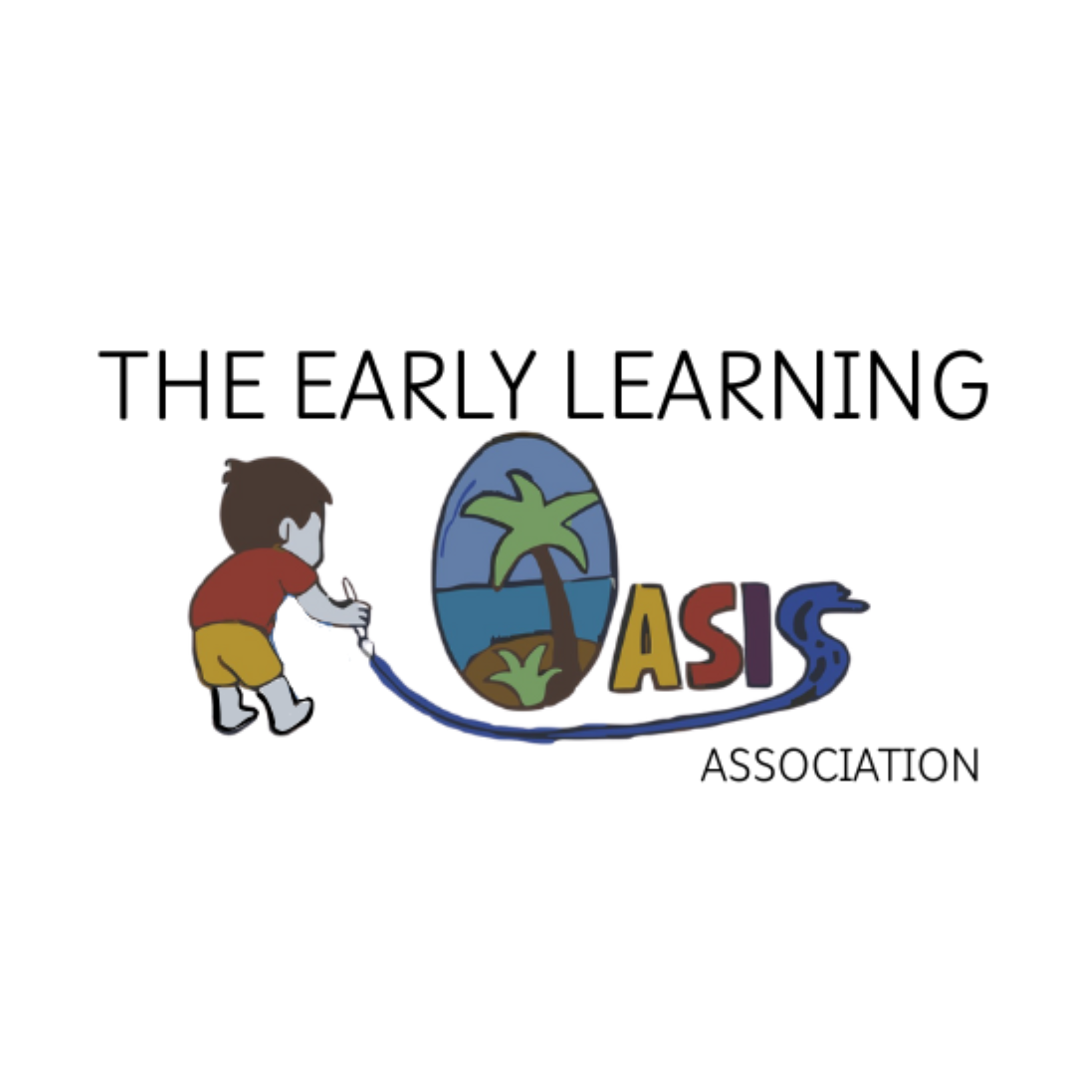
The story of our logo
Our organization’s logo embodies the foundational beliefs which drive our vision and goals. It was strategically designed to represent the beliefs, values, and passion our members hold for early learning. We chose an oasis, as we believe the elements which contribute to a successful childcare centre reach far beyond the walls of the classroom. Children thrive in environments where well-being is a shared resource for the children, educators, families, and the community as a whole. Our organization’s vision is to be an oasis in the early learning sector where everyone can come to be educated, heard, valued, and supported in an effort to encourage and promote growth. The logo being painted by a child is symbolic of the reality that their well-being and growth is the driving force for our success. The colors also hold important meaning.
Yellow- Happiness, optimism, and warm
Red- Attention, activity, and energy
Purple- Creativity and a sense of luxury
Blue- Calmness, confidence, and relaxation

Nadia Myers- Artist behind our logo
Nadia Myers is a grade 12 student who has a passion and eye for artistic creativity. Nadia also works in the early learning sector as an educator in an after school program. Upon hearing about our organization’s vision, Nadia got to work embodying this vision into a logo on paper. Nadia’s involvement in bringing a vision to fruition, is a testament to this organization’s goal to be an oasis where everyone can come and bring their passion and talents to the table.